
 Curious 7
Dogfish Head Brewery faced a critical shelf presence challenge: their existing packaging lacked consistent branding, making it difficult for consumers to identify and distinguish their products in a crowded retail environment. The brand needed a cohesive visual system that would both unify their presence and celebrate the unique flavor profiles that made each beer distinctive.
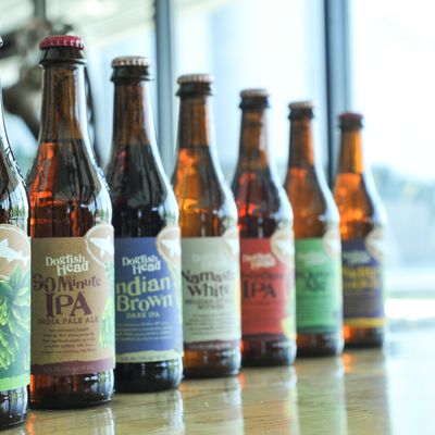
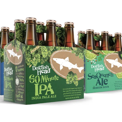
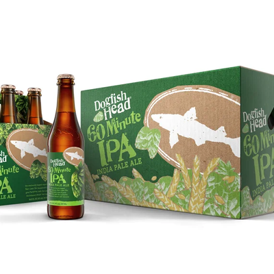
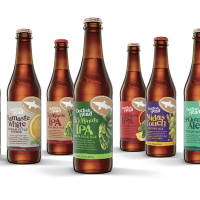
We approached this challenge by developing an ingredient-driven storytelling framework that would create a "billboard effect" on shelf. I began by mapping out the hero flavor ingredients for each variety, identifying what made each beer's story unique. From there, I developed a layout system designed to work seamlessly across all package formats. I tested multiple mock-ups to ensure the designs would banner effectively—creating that critical visual impact when products sit side-by-side on retail shelves. Once I perfected the systematic formula, I was able to move each SKU efficiently through the production process. Throughout the project, I collaborated closely with the creative director at Interact on concept development while owning all layout execution and production work. I also partnered with an illustrator who provided individual ingredient artwork.
The redesign successfully established a distinctive, consistent brand presence for Dogfish Head that balanced unified brand recognition with individual product differentiation. While formal sales metrics weren't shared with me as a freelance designer, the real-world validation came unexpectedly: I spotted the redesigned SeaQuench Ale at my cousin's house, and when I mentioned I'd designed the can, he told me it was his favorite beer and praised how cool the packaging looked—unprompted feedback from a no-nonsense consumer that confirmed the design was resonating in the market.