
What did you do?
Across several separate streams of work, I made calls that determined what using Trove feels like on both sides of the exchange. I cut onboarding down to the moment of value instead of a data collection step. I moved validation forward so it reads as the point of the product instead of an afterthought. And I sourced, briefed, and managed the brand engagement that gave the whole thing a settled visual and verbal language (that is uniquely differentiated in this market!), including the naming research that killed terms alpha users were misreading.
What changed because of it?
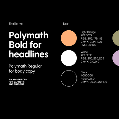
Onboarding now completes in a median of under two minutes (1m 53s), with an ~8/10 completion rate from start to finish. And the Polymath font system, the current color palette, and the product nomenclature are what every user is looking at right now, replacing terminology that alpha research showed was actively confusing people (e.g. Ledger reading as blockchain).
How did you do it?
On onboarding, I killed the "let's set up your account" step and swapped the work-history-and-role fields for a single headline. The role-targeting question was creating a mismatch: someone would pick a path like "establish foundation" and then get asked something that felt like a job application. When we built the supporting intake agent that helps users craft a narrative, I designed the framework to guide those questions (storytelling mixed with behavioral question interview techniques). I decided the form should teach the product by getting someone to their first artifact fast, not by collecting structured data upfront.
On validation, the product had it buried behind the artifact creation flow, which worked against Trove's whole thesis. Trove only holds up if the witness feels like the point, not a confirmation step tacked on at the end. I moved it forward in the experience because burying it reads as "trust us" instead of "here's who was there."
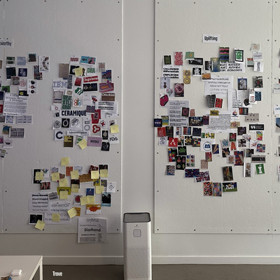
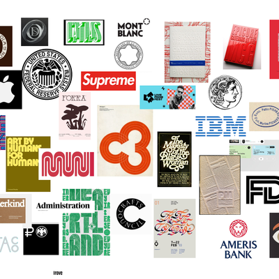
On the design system, alpha interviews had already surfaced confusion with the terminology and visual hierarchy in use, so I ran research with a few dozen participants to figure out what was and wasn't landing, which is what killed Ledger and reshaped how we talked about Artifact. In parallel, I found, vetted, and onboarded Champions as the design partner, wrote the brief, and managed the relationship through delivery. That's where the typeface system, the palette, and the decision to drop the isometric cube motif all came from.


 Trove
Trove

